winterbloom

2/1/23


The beginning of January I was compelled to paint a lonely hibiscus on our back deck. This flower was absolutely astounding to be blooming in a winter setting as well as fighting climate change to start the new year.


Somewhat surprisingly the painting (titled “Hibiscus”) literally sold before the paint dried and spawned a series that was quickly sketched out on a piece of cardboard as pictured above. Judy Costello, (J/Costello Gallery, Hilton Head, SC) was visiting that day and decided spur of the moment for an April solo show based on the cardboard scribbles picture above.


The issue at hand is that most of my paintings take 4 to 6 weeks to produce because of the 60 plus paint layers combined with drying time etc. This schedule was a much more abbreviated time period of three plus months for five paintings. Clearly, I was excited to have the show based on new unexplored subject matter, but anxious about the time table. The first three weeks I was up at 4:30 am seven days a week. Heavy duty dual drying lamps were going all day long and sometimes dangerously into the night. This was ongoing until things seemed under control after the first five or six weeks. Once the first couple of paintings were semi-complete, I took a deep breath and relaxed back to a normalized schedule.


The subject matter for the paintings were iphone photos I had taken of the original hibiscus on our deck. I rotated some of the photos, cropped them and collaged some in photoshop. A couple images were made up from memory from several imaginary sketches as well. All in all, a very holistic and intuitive day by day approach.

August and JOYA

We are now beginning August and approaching my birthday. Always a marking point.

I have been working diligently on larger work started at JOYA: AiR (Spain) in June as small studies and now evolving into much larger paintings. I’m now framing the smaller studies to exhibit at L/Ross Gallery in Memphis and tie into a larger show later in upcoming months. The small watercolors have a life of their own that gives them a unique identity full of spontaneity and energy. They really look nothing like the larger paintings that later evolve. I try to find solutions constantly about larger paintings as decision making changes, but not so with the watercolors. They just are…and very, very intuitive. No thinking or hand-wringing involved.


After being home from JOYA, I discovered a couple more possible residencies and am now applying to them for 2023. They are both in the United States and a bit more accessible. Each locale is on a different coast and each offers completely different experiences and with a varied demographics. I am always looking for new experiences in interesting circumstances. It’s always refreshing to have a future adventure to look forward to and meet people with different backgrounds and points of view. I especially enjoy bridging the generational gap.


My goal after my mid-August birthday is to produce a body of work that is not necessarily gallery ready. I have pre-made stretchers and panels standing by waiting for the beginnings.

Vague ideas are floating around, but nothing solid yet. This work is selfishly intended just for me and not necessarily for the galleries. My challenges are simple things like developing unique tools to apply the paint and make marks. I’m thinking more in terms of larger curves and supporting marks with layered primary colors. But really…who knows at this point? Maybe some smaller beginning paper studies will guide the way. I know I want them to be tribal, personal, and humanistic.

Sicily and JOYA: AiR

May 10, 2022


The last few weeks have been consumed with prep for our upcoming trip mid-May to Sicily (in the works since pre-Covid) and a June residency after at JOYA: arte + ecologica off the grid in rural Spain. There have been many, many more odds and ends to deal with than anticipated. Crazy multiple flights, flight redos, car rentals, Air BnBs, overseas wire transfers, meds, international phone service, art supplies, shipping, etc. All good things to fuss over, but time consuming. I have divided my planned time into pre-trip and post-trip.


I began a TO DO list of Sicily 12 months ago and it has been everchanging. Now I think it covers all the high points. Daily changes will naturally occur for us. Personally I am looking for dwellings that are rustic, rural and elevate my art and vocabulary. Baroque churches are fine, but simplicity is better. I’m trying to go into this with an open mind, but still have ideas of what to expect and see.


I am particularly excited about the Riso Museum of Contemporary Art that showcases Sicilian and International artists from the 1950’s to the present. It seems that the curators have housed ultra-contemporary exhibits in a historical multi-cultural context and have layered the art on the top surface of ancient archeological elements. It is a really rich idea. Also on my hit list are the frenetic open-air markets like Ballaro and Mercato del Vucceria. Full of color, smells, excitement and great street food. I could easily spend hours (or days) in places like this. Wandering the historic villages of Cefalu, Sambuca, Ragusa, Marzememi, Castiglione, Savoca, Erice, and Castellamare will provide inspiration for work coming up later in the summer and the remainder of the year.


The idea is to do a myriad of small thumbnail sketches and take hundreds of research photos and then start the process of deconstructing and rearranging the shapes, memories, and colors. A couple history books have been downloaded on Kindle that will help me delve into the past and influence the Sicilian imagery. I don’t want this to seem like a travel expose’ or “postcards from Sicily” as much as a cultural influence at this particular time in our critical world history. The work will end up being spontaneous watercolors and gouaches 16 x 20 inches done at JOYA. These will serve as studies when I get home later in the summer for larger work.


After a couple weeks in Sicily, my wife will drop me off at the airport in Rome and fly home as I head for Spain and the off the grid residency at JOYA. Of course, JOYA and it’s hilly, arid geography are equally stunning with a 180 degree departure from where I live in flat, humid Georgia. There's a pretty good possibility that I will be doing “hot” paintings with warm, luminous colors. I’m looking forward to exploring the immediate surroundings looking for interesting “fincas” and simple vernacular architecture embodied with a rich history of the area. The resident mix at JOYA promises to be an interesting international group with shared meals and conversations. Simon and Donna Beckmann, the U.K. founders of JOYA, have focused on sustainability and environmental innovations as well as their individual Artmaking. JOYA serves as a global working lab for their practices and philosophies, while providing a unique and unusual refuge for international artists in an extraordinary setting.

time and risk

March 14, 2022


Since the New Year, I have been much more aware of time, especially as a commodity.

The amount of time it takes to complete a painting has been (by design) simply the amount of time it takes. For example, I paint in layers with the art positioned on sawhorses or a horizontal table situation. Each paint layer takes 2 to 6 hours to dry before the next layer can be applied. I usually try to do only one piece at a time which leaves a lot of downtime for the business side. There is relatively little blending as the combined layers do a transparent blending. That one-piece-at-a time scenario allows me to totally focus on the work at hand and solve the unique problem inherent in only that piece. I study it, do small sketches and even take notes. Crazy-time consuming and perhaps just a smidgen OCD.


I am trying now to have two to three other pieces going simultaneously. These are usually smaller and feed off the composition and colors of the primary piece. I have lost the laser focus that I had before, but developed more spontaneity and risk-taking. Pretty good tradeoff so far. I am not sure how this is going to play out long-term, but right now it involves new materials, paint applications, and process.


As this idea of multiples progresses, it seems that new work is evolving from the starter piece and makes a complete thought, and maybe even a series. New compositions, concepts, and edits are discovered within the “primary” composition to be used or altered for the companion pieces. Shared colors are certainly a time-saving benefit., but so are the edits and refined concepts.


I should mention that there is no hesitation about altering a “finished piece” months down the road and many times it takes that long for the work to ferment or be destroyed. Some pieces are two years in the making with several trial versions under the final. 


If all this sounds like ART goobledeegook, I encourage you to try this method even if it is on a small scale. I’m still working on dealing with the “frenzy” and potential mental “chaos” of multiples, but see potential on the horizon. 

studio reno

Jan. 1, 2022

It started simple enough. In September, while I was attending the Cill Rialaig Residency in Ireland, I decided to have the popcorn ceilings removed in my studio (read commandeered two-car garage) at home by a contractor, revealing bare drywall in need of repair. Messy, messy job and the contractor earned every penny he was paid doing this job. I had wanted to install a new lighting system (eliminating the old dim fluorescent lights) that provided color correct daylight, but needed the ceilings to be in decent shape. After acclimating to being back home again, I decided to take on the task of retaping all the ceiling seams and patching rough spots. It gave me new appreciation for the guys that do this professionally daily. A lousy, dusty, strenuous, painstaking job. While I was waiting for the joint compound to dry daily, I thought why not fix one of the worst walls in the studio while I was at it. No big deal, right? Well, I think you realize where this is going. Every surface I touched caused me to redo another surface for what is now a complete remodel and two and a half months later.


A little background. I have an artist friend of mine in Memphis, Matthew Hastings, that is also a lighting guru. I was particularly impressed how he lit L/Ross gallery where we are both represented. I had never seen my own work look so good. A couple pieces I hardly recognized… the colors were so vibrant. I badgered him on how he did it and he gave me the specs for the bulbs he used. When it was time to install new studio lights, I scoured the internet for info and came across a company that provided the lighting heads that were preferable to me. They were easy to clean (important in a dusty environment) and could handle large 150 watt, 3000 lumen LED daylight bulbs. I called a known lighting company in NY for specs and prices. They sent me all the specs and installation info, but prices were high. I then took the specs and searched Home Depot online. They carry many items online that do not exist in their stores. Happily, Home Depot had the same desired manufacturer (W.A.C.) and all the necessary components for the tracks, heads, bulbs, and connections and for the right price. I laid out two 8’ lighting tracks and carefully installed them on the freshly painted ceilings. The lights were spectacular and made the space immediately look like a gallery. I was elated. Money and energy well spent.


My wife, Tricia, came out and looked at the space and innocently commented that she could organize this to get twice as much space with far less clutter. She’s pretty good at this kind of stuff. I listened to her ideas and opinions and after a couple days ruminating, decided to redo everything, including cabinets, layouts, tables, counters, shelving etc. based on her ideas. Of course, now I was also in the midst of completely finishing new drywall on all the walls with new crisp white paint. Everything White! The main focus was to have one 20’ bare wall. This wall would be dedicated to hang work for studio visits or to paint work vertically on the walls…something I rarely do for lack of space. Tricia found an article for me on Food52.com (https://food52.com/blog/25737-best- paintforcabinets?) that gives great info on painting kitchen cabinets. Most of the studio cabinets were recycled from our original kitchen. The article went into great detail about the process and amounts of paint coats necessary. It was a long process and still ongoing. Lots of sanding, primer, and many, many top coats with a sponge roller. I would not recommend it as being durable enough for a kitchen, but certainly fine for a studio. The place looks entirely like a different space and is now organized at least for the time being. This process has forced me to throw away stuff I have not used. I developed a two-year rule doing this. If something had not been used in the last two years, it was gone. Space is simply too valuable. Artists have a tendency to collect and store interesting found objects, but I am brutal about making the studio more spartan and minimalistic. Still, I accumulated a lot over the years and still need to pare down. Right now the space almost seems too pretty and fussy to work in, but it is definitely more functional.


After much deliberation, I decided to buy a couple (Huskey 52 in. Adjustable Height Work Table with 2-Drawers in White) adjustable workbenches from Home Depot with shallow drawers and casters. They were on sale for about $225 each and the idea is to group them together for large paintings and they have shallow drawers to hold small mixed paint containers. I tossed out the old sawhorses and 2x4s I used to paint on. When I picked up and unpacked the workbenches, they were extremely solid steel construction and I wondered how they could sell them so cheap. As I began to put them together, it was obvious why. The directions were really obtuse and many of the machined screws and threads did not line up. Each workbench took about three hours to put together. However, once done and my frustrations eased, I was still happy with the result and the table surfaces really trick out the new improved studio and give lots of options.

I’m on the downside of all this and finishing my punch list over the next couple days. Should be in and using the new space this week. About time.

the cow on the top of the cliff


October 2, 2021


Day 1, Cill Rialaig Artist Residency.


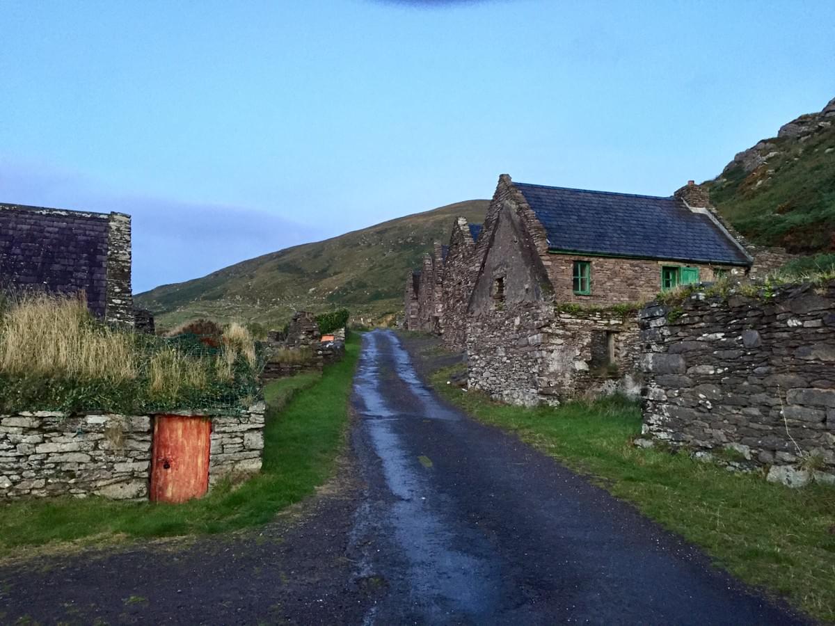
I arrived at Cill Rialaig through a series of interconnected skinny, 6 foot wide deeply rutted back-roads in the middle of nowhere, Co. Kerry, Ireland. Coming around a hairpin corner a vision of an 18th century stone village appeared, set at the base of a mountain overlooking the craggy cliffs of the Atlantic. After catching my breath and noticing the absolute silence (I mean nothing), I started to unpack and set up shop in my very rustic accommodations. As I looked up through the skylights in my small studio there was a black and white cow at the top of the cliff peering down at me nonchalantly. She was about 300 feet up looking straight down at me while munching her food. She stayed there for approximately three hours in this precarious position.


The surreal next few days were full of energy and experimentation and lack of sleep. The natural pigments I had made the week before were used specifically on Arches and Fabriano heavy Watercolor paper. The colors seemed to devour the surface and strange chemical reactions occurred as one color overlapped the other. Totally unpredictable! Additives like alum salts, citric salts, gum arabic, vinegar and table salt all had varying chemical effects on the colors. Trial and Error! I started with quasi-representational rural architectural imagery that eventually evolved into abstraction. Some paintings were worked on for days and others more immediate and spontaneous. Usually, because of the lengthy drying process, there were five to six pieces in the works at one time. The journey seemed pre-ordained and chronological with a direction of its' own. I worked day and night and took naps as needed. Almost a monastic experience and consuming. I even shipped some of the raw materials that seemed unique to that region back home. This included fuschia, soft ochre rock, a reddish seaweed, and dock.


I am now in my third day back home and trying to decipher what's next. Three of the smaller pieces are already slated for an upcoming show in Florida, another two will be going to Memphis and most are just the beginning studies for larger work to come. I'm not sure how all this will play into my future processes and outlook. I am not a purist (like my workshop mentor, Kari Cahill), but will use the natural foraged pigments freely where needed. I imagine it will be a healthy mix of acrylics, mixed media, and the natural pigments. To early to tell yet and now i need to find and make my own pigments from my home location. I am really excited about using and making pigments from specific sites chosen for paintings that will then make a complete statement. I should add that i do NOT know how all this will play out on large gessoed surfaces yet. TBD.

make paint?


October 1, 2021


I am writing this in spurts in Ireland. So much happens in so many variations. As mentioned in my last blog, I was fortunate to take a workshop in Sligo with Kari Cahill, an artist that uses foraged materials to make natural pigments. The learning curve on what Kari explained was severe. I only had a glimpse into her world and know that she is a purist on this subject. The colors she arrives at are layered and strategic. She understands the complexity and chemistry of her colors. Her approach is scientific as she keeps copious notes, samples, and sequencing processes. 


I took the information Kari provided, and for one week prior to my Cill Rialaig residency, rented a small cottage near Ballingskelligs Beach, Co. Kerry, Ireland to produce the pigments. The cottage had a good functioning kitchen (my improvised lab), access to natural materials (my sources and future art supplies), and a space that could be turned into a small studio (dining table). I learned very quickly about how to boil plant material and  how long, also how to add extenders to make the colors bond to the surface. A lot of give and take over an intense week of work. When the time was over, I had approximately 14 glass bottles of pigments. Some were highly chromatic and some were subtle and watery. This time period was only about making color. It also raised many questions to be asked later. As I packed up the materials (lots of zip-locked bags of plant material) and the sundry basic equipment, I felt confident that I had something to work with for the real creative time period coming up at Cill Rialaig.


cill rialaig, kari cahill, and october


September 6, 2021


In a couple days I will be taking off for Ireland to spend the rest of the month. As mentioned in the previous blog, the origin for this trip was my Arts residency at the Cill Rialaig Project; originally applied for in 2019 and then selected and finally scheduled for 2020. All delayed because of Covid until now. I am now going helter skelter and simply hoping for the best. Ireland officially re-opened on July 19th to U.S. citizens. I have even scrounged a third Covid booster shot (kinda under the radar and with a bit of truth stretching) and had a negative Covid test yesterday just to get me into the country and hopefully back.


I also discovered that ex-Cill Rialaig resident artist, Kari Cahill, was giving a workshop (foraging and making pigments from natural materials) a few days before the residency was to begin. I rearranged travel, booked her workshop and this is where we’re at. Kari is generously helping me arrange to pick up various “extenders” and enhancing potions for the pigments since my residency will be based on the information I glean from her. The workshop takes place in Sligo about 6 hours north of the Cill Rialaig residency. Kari suggested that as long as I was in that part of the world I should take a day out and go for a “wee” 5 hour drive along the northern coast through Mayo to Galway and see some spectacular scenery complete with small one-lane roads and apparently pretty dicey hairpin curves.


To make matters even more interesting, I was asked by J/Costello gallery (Hilton Head, SC) to do a 48 x 48 inch commission before I go. Just finished that and fortunately the client seems very pleased. Gallery owner Judith Costello has now had the interesting idea of doing a show when I return based on work produced at Cill Rialaig. Love the idea, but no pressure right? That means the stuff has to be worth looking at in a medium I know nothing about and with all new subject matter. Should be interesting. Judith even has a writer lined up to do an article about the show and work that doesn’t even exist yet.


In addition, my reliable old Ipad (which I always take to these remote locations) conked out a couple of days ago. Just bought a new “used” Ipad Pro and reconfigured it to the old specs. My wife, Tricia, kindly dedicated a complete day helping me coordinate all the tech stuff and new installs. She really is a genius tech guru (and calm as opposed to my chaos), but in real life a college sociology professor at GSU. We (read Tricia) got the Ipad Pro working beautifully as of this morning. Whew! I really needed that technology to stay in touch with Tricia remotely through ZOOM or email and to store visual information from the trip.


So if that’s not enough, I decided that while I am gone for most of September, it would be an opportune time to do a little studio redo. I just had a Velox sun tunnel (like a skylight, but cheaper) installed a couple weeks ago that gives off pretty good light to color correct the paintings. My studio is in our converted former two-car garage, complete with asbestos popcorn ceilings. I have wanted the $%*!#? popcorn removed for years and decided NOW is the time. I have hired a trusted all-around contractor to do the removal and clean up the ceilings and retape the joints over the next few weeks (I’ll do the painting when I return). This has meant cleaning up the studio substantially and somehow putting all the clutter out of the way to allow for the ensuing mess. Temporary storage includes stashing stuff inside bathrooms, closets, bedrooms, and dining room. Just finished that an hour ago with a tad bit of chaos.


Now if this ain’t enough to keep me going, there is a scheduled mid-October four day road trip to Atlanta and Memphis to drop off paintings at my respective galleries in those locations. That means getting all the work (probably 15-20 pieces) prepped, labeled, wrapped, etc so they will fit in a rented SUV. There’s actually more brewing, but my head is spinning enough. The next post will come from Ireland… preferably over a pint at a nifty local pub.

painting with geckos


May 27, 2021


For the last two days I have had an uninvited visitor in my studio…a lightening fast little green gecko. He seems to enjoy (and not in a visual way) the 36 x 64 inch painting I am working on and travels from end to end repeatedly. BTW, I paint flat on sawhorses so the little green guy has a relatively smooth, flat surface to run around on. The painting is composed of earth colors which might seem to resemble Mr. Gecko’s previous environs. Now that it is the second day he has been in the studio, I am starting to worry about his future. Unless I fill the studio with lettuce and dead flies, he may not have enough to eat and drink. The only water available is the water used to wash out my brushes. Kinda icky for a growing gecko. Yes, I have tried to gently catch him or scoop him into a dustpan for further transport, but he is too quick and too smart. He changes colors as he travels over the painting and likes to leave wet “footprints” all around.


After dealing with him for a couple hours this morning, it was time to call in the PROS. The Pro in this case is my wife, Tricia…the feel-good, nature-loving, wildlife afficianado. She has saved all kinds of living things; birds, humans, squirrels, turtles, dogs, moths, and now hopefully a gecko. The first thing Tricia did was fashion a little scooper out of a discarded cardboard box and move gingerly around the room trying to cajole the little reptile into a transport machine. No dice! Eventually he jumped off the painting onto the floor and scampered up a wall. Thankfully there was a door open as Tricia scooted him out through the opening and onto freedom and a long life everlasting. It’s already been a good day and it is only 7:35 AM.

what, where and when.


April 2, 2021


April 2021 is a pivotal month that has been in the works for over two years. A new gallery (Reinike Gallery) in Atlanta is firmed up that is exciting, with work being delivered mid-month. The show at J Costello Gallery in Hilton Head (“outside looking in”) has been happily extended for another month, ending now in the first week in May. April 12 begins a long awaited road trip to the Misssissippi Delta for research on vernacular architecture and then on to Memphis to rotate new work at L/Ross Gallery and finally back to Reinike Gallery in Atlanta to drop off work for the first time. The following week, work is being delivered to Gertrude Herbert Institute of Art in Augusta for a solo show there in an elegant, historic Federal architectural space and gallery. The work has never been in a more beautiful location. Although much of this has been in the planning stages for over two years, it is all coalescing at the same time, involving packaging, framing, travel plans, numerous van rentals, and list after list about what goes where and when. Personal organizational skills are not the best, so there is a tendency to over-compensate. Honestly, not complaining…just a bit overwhelmed at 2 am and making mental notes about what happens next.


I have worked steadily towards these goals since beginning a full-time art practice in 2014. Gallery Shows will now run through the summer. Two new residencies (that are very unique) have been applied for and a couple new solo shows as well. The momentum begins as we eke slowly past Covid. Even on this sleepless night I am feeling extremely fortunate to be pondering the next move and grateful for all the new people met in the last year… even in relative isolation and many times virtually. And so the lists continue. Without getting maudlin, I should mention that my wife Tricia has been an unwavering advocate, critic and advisor in this process. I would not be doing this without her encouragement and support. No kidding.

paintings of hope


February 16, 2021


After wrapping paintings (mostly architectural) to go off in different directions for solo shows for the next six months, I am about to embark on a new direction that is based on optimism and grace and perhaps more ethereal. This began with the results of the election and after four years of dismal, overbearing news events and twitters that many times were inhumane, it seemed only fitting to renew my mindset. I have not physically done this work yet, only cerebrally. I will mention that the imagery will be based on looking upward, tentaviely titled the “Skyscape” series, and relatively abstract. It will be gestural, intuitive, and based on seeing into the sky through the growth of trees and plant forms. Times of day, seasons, weather and reimagined colors should complete the scenario. I have a vision of what the work should look like, but based on past experience, I know that the paint drives the directions taken and has a life of its' own. Some of this notion has evolved from skies and plant growth that served as secondary backgrounds for previous paintings, but many times my favorite elements. We’ll see what happens over the next few months.

covid christmas


December 26, 2020


Just finished Xmas.


We are extremely grateful to be safe with a roof over our head and with loved ones okay, although isolated. My beloved family doctor (and also the Head of Family Practice at the local Hospital) just finished up with an ugly two-week bout of Covid-19 along with 4 of his residents and half a dozen nurses. Not a pretty picture. My wife, Tricia, begins a treacherous semester in two weeks teaching face-to-face overloaded college classes in unsafe classrooms. She is as uneasy about this as I am and desperately trying to make it safe for her students and herself. Not an easy task with little help or common sense from administration. My days are much easier than hers. They mostly consist of waiting…waiting…waiting. Waiting to hear back from a new gallery. Waiting to hear about a post- poned solo show. Waiting to hear about applications for upcoming shows. And above all else waiting for the Vaccine.


For the past 10 months we have kept our bubble pretty tight. A couple trips to galleries in Florida and Hilton Head, a half dozen trips to Home Depot and a few very limited Covid-safe coffee meetings. All other necessities have been shipped to our doorstep and early Sunday morning bi-weekly trips for groceries. The plus side of all this waiting is producing. I have produced three times as much work as any other year. Some good and some questionable, but a steady flow of work.


At this moment I am working towards a museum proposal as well as reworking pieces that I think can be improved. Some I have scraped and painted over, others it’s a matter of reworking. It’s a healthy process. I’ve constructed four new large panels that are ready to go and have a list of ideas for the beginning of the new year. My first estimated travel plans will be to Memphis in late March or early April to deliver new work to the gallery there. This means renting a van and probably 3 or 4 nites on the road with a detour through the Mississippi Delta for a reconnaissance of locations for a new body of work. I won’t do this until I have both shots of the Vaccine and it is safe. I have a couple solo shows scheduled soon after that then leads me into summer and my long awaited Arts Residency in Ireland at Cill Rialaig in September. Most of the applications I am now working on are toward 2022 already. I am thankful and amazed that all the galleries I am dealing with are staying afloat…how I have no idea. I think it is because of good business practices and determination. I have sold five pieces during this time period which seems a miracle all things considered.


If all this sounds down and grim, let me emphasize it is not so. There is so much to look forward to this year and it will be fully packed.

identity


September 23, 2020


A couple days ago I met an artist who I may share gallery representation with. We met for the first time for coffee. I have admired his work for some time and he lives nearby in Savannah and has traveled widely and lived all over the country. I really knew very little about him except for his work. We both have complex histories and were both previously involved in the communications world.


This meeting was totally spontaneous, interesting, and easygoing…something I have missed for a while in the time of COVID. However it caused me to think as I was driving home about my own identity, especially in a time when we are all grappling with so many social issues.

How would I like to be indentified? The first and foremost word that comes to mind is as an Artist. That is the pinnacle for me. I have worked and strived for that word since I could walk. However other possible positive/negative descriptors include:


  • male
  • caucasian
  • older
  • baby-boomer
  • husband
  • father
  • grandfather
  • teacher
  • director
  • blue-collar
  • educated
  • hands-on
  • fair
  • moderately traveled

In my mind all these descriptions coalesce to form the word Artist for me. Sure there is training, reading, classes, experiences, and skill-sets involved. I look to many artists from different genders and race for inspiration. Some of those pathways are difficult to imagine and even relate to, but the results are continually stunning. I am in awe of these individuals and want to see through their eyes, if only for a moment. This becomes powerful content that gives me something to work towards. Artist is still the word I covet and becomes the visual dialogue of injustice, health, inequities, daily struggles, fairness and perception.

renewal and reset


August 21, 2020


I had a birthday a few days ago that was a marker and a quiet, grateful celebration. After all, we are still in our isolated bubble of quarantine. However there have been a number of recent events that have caused me to reevaluate what I’m doing and how I’m doing it.


Let me begin by saying that since 2014 when starting to paint professionally, there has been a conscious strategy to build work content and establish professional credits. This has been in the way of competitions, museum and university shows, residencies, sales, and in the last eighteen months…galleries. The time sorting through all the business aspects occupies 8-12 hours a week minimum. Keep in mind that does not include the actual studio work, which includes mundane tasks such as framing, packing and shipping.


Work has progressed steadily according to plan (as I learn how to handle rejection and acceptance) over the last 6 years. I was even starting to make enough to pay for materials and shipping with a small amount left over. Sales were brisk, but came to a complete halt at the beginning of March with COVID. I have been constantly worried about my galleries’ ability to stay in business in this new world. So far, they have managed to do so with obvious limitations. This time period made me reassess my relationship with each of the galleries. Each one desired a little different kind of work and for different audiences, which has not been an issue so far. Regretfully, I decided a few days ago to pull out from one that seemed an uneasy fit. Thankfully another one has taken its place and seemingly with more opportunities and more aligned with my philosophies. I have been working for the last few months to supply the needs of each of the galleries. All good, except that I have noticed a new propensity for playing it safe and a lack of innovation. After my “marker” birthday, which always causes me to take stock, I decided to spend the next couple months painting for myself and experimenting more. This seems vitally important in context. Subject matter may stay within the same vocabulary, but the physicality, materials, and processes might change significantly. Time to switch it up a bit.


I am also increasingly more involved with doing work for selected non-profits. The latest upcoming event is for our local Hospice in conjunction with Peter Roberts’ Location Gallery and my friend and Arts Advocate, Beth Logan. These community events are always something to look forward to. An Instagram friend also just pointed me in the direction of possibilities for helping develop a program to fund minority art students…still in the conceptual stages.

As I am in the midst of revaluating, these considerations will hopefully serve as an impetus for the next few months until COVID and the world stabilizes. I am fortunate enough to have several solo shows upcoming in the next year that keep will keep me focused and on track. I think it will be good to reset a bit.

THE ideal house


July 8, 2020


In my perfect world, THE ideal house is very similar to a Monopoly Game House. It’s a simple rectangular shape with a 35 degree pitched roof. This structure would hopefully have a front porch (for neighborhood interaction and to gauge the weather), two to three bedrooms and a simple addition off the side or back. Probably made with hand tools. Wood or brick front stairs. It would follow Corbusier’s rule…”form follows function”.


The houses throughout time that correspond to this description include Romanesque houses, simple Italian or Portuguese rural stone houses, or perhaps Irish pre-famine houses. In the United States, these have translated into slave cabins, tenant houses, depression shacks, migrant labor shanties, or Southern shotgun houses. Sometimes they might be in the form of Scandinavian log cabins. In the 20th century these simple houses could be ordered through Sears and Roebuck’s catalogue for owners to build themselves from kits. These shelters usually make use of indigenous materials and sit well in the environment.


Of course now they are disappearing in the advent of McMansions, bad rooflines, and humungous driveways. The rooflines are always a pretty good indicator of bad design. Usually the many-faceted roofs run into each other at convoluted angles and don’t allow for straightforward drainage and look clunky. I have three neighbors with new houses with complicated rooflines that go nowhere. In all fairness to the Architectural profession, these were most likely designed by contractors. The rain can’t find a way to run off and neither can your eye.


Of course I am always looking for social context to place these houses, but usually the simple design and social constructs go hand in hand. You know just by looking at the humble exteriors

that they are cozy, albeit small, and warm. Sure it’s probably rough and tight living, but the possibilities exist for strong family hierarchy and responsibilities. In the digital age these could be the missing architectural necessities. Probably the only commonality is the ever-popular open floor plans.


This ideal house is the one I am always on the hunt for and searching for. I’ve even lived in and remodeled a couple of them. Somehow these houses keep to my minimalistic needs and conform to Corbusier’s rule. Seems pretty elementary to me, but not so easy to find.

redos and lost causes


May 1, 2020


After over a month working on a large piece, I am compelled to paint over it with new subject matter and a complete redo. I absolutely abhor giving up on a piece as a lost cause, but know that something good will eventually come out of the purge. I did the same kind of redo thinking with a commission piece I am working on. A big portion of it was redone early this morning and for the better. I force myself not to be complacent and have the need to push the work over and over. This is necessary for my own evolution. Conceptually, my work is relatively calm, but I have the need to inject the imagery with question marks for the viewer. I am constantly battling the geometry of the composition against the paint applications…the rough and the smooth.

I crave evidence of my left hand making marks and leaving a history. When I am in the work zone, I grab whatever tools are near, trip over nasty extension cords, bump tables and hurry to force the paint to flow in the right direction and density. And then breathe a big sigh when that burst of energy has passed and can only hope all looks ok in the morning.

looking.


April 6, 2020


In this time of COVID 19 isolation, I am lucky enough to spend my days in my studio cranking stuff out. At this moment I am working on a relatively large piece (42 x 54 inches) from my Morocco series. I am on the third week of it and it has been a struggle as I am rounding the corner towards finishing. One of the things I have noticed about this (and other pieces) is that I spend inordinate amounts of time just looking at the work. So much so that I look more than I actually paint. Just staring. I mentally change colors up and move shapes around. When I am sleepless at night I think about the painting (thankfully rather than the virus) and literally paint in my dreams. Sometimes I even get up at 2 AM and go out to the studio and work for a few hours to get it out of my system. Still looking though… and searching for answers. When all else fails (as it does regularly) I get out my little 9 x 12 drawing pad and a box of oil pastels and do quick sketches of the same subject matter or problem. Somehow my drawings ALWAYS solve the problem. They intuitively go to the right shapes and the simplification of color. My head doesn’t, but my hand seems to do so. Everyone does this stuff differently but this is my methodology such as it is. I’m still looking though.

waterlife


January 11, 2020

In this part of the world (the Georgia Lowcountry), we are surrounded by water as it it influences our everyday lives. Of course, the yearly hurricanes, torrential rains, humidity, seasons, and storm surges all effect our living conditions. Particularly noticeable are the famous marshlands with up and down tides defining the land masses daily. You can't help but notice the movement in the marshes as teeming wildlife concentrate on feeding, survival, and reproduction. It is easy to imagine this as being the source of all life since the wet and goopy conditions seem prone to birth, evolution and discovery.


Artists have been drawn to this genre of landscape imagery for reasons or time of day,
the tides, and amazing splendor of the refracted light from the water. I have tried to stay away from the obvious and done only a few paintings of this so far... and even so with my own spin on them. I have tried to find new compositions; flatter, more abstract, intense, and intimate. As with all my work, there is the "magic point" where the paint application supercedes the subject matter and rules supreme.


So it is in the oncoming weeks. I have been tasked with a large upcoming commission and am in the midst of doing preliminary studies to find my way towards the final visuals. Luckily I have been left to my own instincts by the client and was immediately to drawn to water/land masses. So far my references have been Sapelo and Skidaway Islands and Pinckney Wildlife Refuge, as a combination of those locations is brewing in my head. The colors of the water, the depth, and the radial light are deceptively complex. Since I paint with a multitude of layers, it is an opportunity to reach some new depths and color interactions. A wonderful thing to be focusing on as we begin the New Year and deal with the startling realities of climate change.


mind drift at brush creek


September 28, 2019


The moose, the actress, the country singer, the magic bunny, the novelist, the one-percenters, the opera composer, the surreal mule deer herd and the occult were all elements of the the best days of Brush Creek. Did I forget the eye-poppin’ cinematic sunrises peeking over the snowy mountain range that you think are maybe Hollywood special effects? Oh yeah, gin and tonics at Falcon’s Peak as the stars creep out. Every day at Brush Creek Foundation for the Arts was special and somehow the hours run into each other with no notice of day of the week or sometimes time of day. It is a mind drift. I should also mention that this residency is in Wyoming in the Medicine Bow National Forest at one of the most scenic and beautiful places in the country.

It was an honor to have been selected previously in 2015, but this time was really different. I knew a little more of what to expect and how to establish realistic goals that would push my work forward. The group I was now with was a little more mature, and greedier for time, space, and growth. In addition, Sharon Hawkins (el Jefe and Director) had added many little touches that tightened things up and made everything more enjoyable. Other residents were chill and all very self-directed and extremely competent in their own disciplines. It was always a mesmerizing pleasure to hear them share their personal processes, backgrounds, and obstacles. Seems like everybody had taught at one time or another and the stories were perpetually entertaining. Many of these people will remain lasting friends I am sure.

I had previously determined how many pieces would be done (at minimum) and in what sizes and format. I had pre-built cradled panels 20 x 20 and 18 x 24 inches at my home studio. The work done on Canson Montvale 140 lbs. paper would be laminated (NOVA Super Gel) to the panels when I returned and serve as studies for larger (42 x 42 inches and up) more abstract pieces later. I had arrived with over 1500 photos from Morocco, a large itinerary map, diaries, and notes from our trip to Morocco a few weeks earlier. Morocco represented a completely different culture and experience and was bouncing around inside my head. I needed to organize my thoughts and get some of this stuff visually out. Seems kinda wacky to work on images of Marrakesh in the spectacular wilds of Wyoming, but that’s the way it went for the first couple weeks. Night and Day. Had trouble sleeping so I simply gave up and painted late at night or early (2 am) in the morning until I got tired. Took a nap and then resumed. Just kept this regimen up for a couple weeks. I only took a couple hikes and trips to town, but mostly concentrated on my obsession to get some of this stuff down on paper. Some of the images came easy and were done in several hours and others took up to 30 hours each. All will be more abstracted as they get larger. I looked at my photos, but depended and trusted little thumbnail sketches that I did for each image. Those become the Bible to work from. I did not have my usual tools and bag of tricks handy and the simpler tools certainly altered the imagery, many times for the better. If I had it to do over, all the images would have been only black and white. This would have saved significant shipping costs for art supplies and would have simplified the imagery even more. Next time I hope.

I talked to my long-deceased father there on hikes, and forced myself to hike beyond my normal endurance. I even thought of trying to have my ashes scattered there. I think that may have scared Sharon Hawkins just a tad bit. This part of the world has obviously stamped my mind indelibly. Great, great place. Thank you Mrs. White.


five jobs.


April 27, 2019


Jerry Saltz, the self-esteemed Art Critic, recently posted his first five jobs on Instagram. Here are mine:


Strawberry picker (Summer job). 13-15 years old. Picking strawberries was just plain boring but gave me the chance to flirt with the girls also picking. Yes, I got fired a couple times, once for putting firecrackers inside the hood of the farmer's transport bus.


Sweep sidewalks and clean dime store windows (After School). 14-17 years old.


Sweeping sidewalks was the most humiliating because other kids always came by and ridiculed my situation. However, I later learned to use sweeping as a tool to have quiet time and attack my own nervous energy.


Cannery Worker, graveyard shift. (Summer College Job). 18 years old. Working in the Cannery was the most grueling scenario, physically and mentally. It was assembly line work with no let-up, but fueled determination. I was fired once for a major spill, but rehired immediately at another Cannery.


Re-Paint room numbers on local high school doors (College Summer Job) 19 years old. Repainting hundreds of room numbers on doors gave me a chance to practice brush skills, perfection, and speed. I was hired because I was the so-called town "artist".


Sort and count screws for inventory (Summer College job) 19-20 years old. Sorting screws and inventory taught patience and big picture goals. Really liked this job and the people I worked with…even the bosses.


Obviously, none of these jobs are on my CV or Bio, but perhaps should be. In some ways they have all contributed to my professional outlook. In retrospect, they were all humbling experiences and gave me some insights into work ethics.

travel


March 18, 2019


Travel always brings the questions:


What are people doing for a living here? How many people exist in one house? How do they relate to the land? How much money does a household live on? What about education and healthcare? Did they stay there all their lives”?

The possible answers have led to my own made-up final destination composed of simple houses, farms, or neighborhoods usually in disrepair. Of course there is rust, peeling paint, broken windows, and rotting wood. These sites have been discarded for better economic growth and less conflict somewhere else. You see, I know something about these kinds of fading places. My parents and grandparents came from poverty and lived blue-collar, ramshackle lives…survivors of the Great Depression. I mean dirt floors and baths once a week on Saturday nights. I have visited hundreds of these sorts of places and all hold a continuing fascination. The commonality is that all the shelters are simple shapes usually made with mostly hand tools. Rooflines and front porches remain important and nearby towns always have a main street.

These places were visited, then sketched, photographed, remembered, or discovered in some kind of archive. The structures become the focus of paintings and represent lives passed over…dreams extinct. Usually halfway through the concocted art, the paint process takes over. Color has its own direction and new variations suddenly appear. Chisels, electric sanders, grinders, drywall knives are brought out to redefine the image. Marks disturb the surface. Redos are evident, occurring over and over again. Construction lines show scars of false beginnings. Buildings stretch or shrink, windows and doorways are added or subtracted, darkened or lightened. Shapes are reduced. Skies are bigger, smaller, grayer or brighter. Color and composition is the new boss. I am only the interpreter and assembling all the responses of these disparate buildings from Oregon, Illinois, New York, Florida, Mississippi, Mexico, Portugal, Germany, Italy, Ireland, New Mexico, Wyoming, Georgia, the Carolinas, etc. It is a conglomeration of lives imagined.
pink


January 26, 2019


I just received an invitation from Peter Roberts, the ever-adventurous curator at Location Gallery in Savannah to participate in an upcoming show titled LUSH. The proceeds to go to the League of Women Voters. The idea is that 60% of the imagery needs to be in pink. Nice idea!

Most recently, I work from dark to light with bitumen as the ground (deep deep brown black). So the notion is that pink layers will be built up over the bitumen. I am doing three small 20 x 16 inch canvases at once…something I rarely do. To make this even more challenging, I have decided to incorporate day-glow fluorescent pinks as well. I suspect this will be a salon show and want the work to pop. Day-glow should do the trick. The interesting part will be how these colors interact with each other and mix. Nice little experiment overall. Kudos to Peter Roberts for thinking of it. I did not think pink is an easy color to work with, but have since changed my mind. I have keep mixing several shades and variations of pink and especially love gray-pink. Almost an ashes of rose hue. My marks are decidedly masculine, crude and expressive so the color phenomena adds an interesting contrast.

What does pink mean? Most people think of pink as extremely feminine. I like it as a highlight or lighting trigger or maybe a soft color substitute for white. Still pink has connotations. I recently had a favorite neighbor that made a pink pussy hat for me to wear to political protests. I was honored! However, in producing these paintings it became increasingly obvious that pink is energy...pink is sexy…pink is happy...pink is optimistic…pink is saccharine…pink is comfort…pink is time of day…pink is punchdrunk…pink is power…pink is growth and so on.

raw architecture


December 1, 2018


December focuses on work based on architecture. For the last couple months the tabby saddlebag Slave cabins on Ossabaw Island have been my subject matter. I have experimented with all kinds of compositions, formats, and paint explorations. Dozens of little chicken scratch sketches that have guided me as well as color palette tryouts. It is all in the mysterious experimental stages. Not quite sure where it is heading, but there is other architectural content lurking that has recently poked through my conciousness. I suspect that at least a few of these ideas should be fulfilled before moving forward.

A couple years ago I stumbled on archival photos at Armstrong University (recently absorbed by Georgia Southern University). As a class project in the early 1940’s, Armstrong students created books of documentary black and white photos of the environs of Savannah focusing mostly on people living in poverty and difficult surroundings. Many of these structures had no water or electricity and were made out of found materials. Hard to get those images out of my mind. They include Yamacraw, defunct Frogtown and (now bulldozed) Tin City. Interestingly, and sadly, many of the images look like contemporary refugee camps and even local homeless camps.

Originally I was interested in making a statement about the structures and context, but now am looking at a more painterly approach dealing with brighter colors out of context. I am hoping that might draw the viewer into the image with more immediacy with the added benefit (at least from my perspective) of forcing questions. We’ll see.
comfort zone


September 18, 2018


Recently I have decided to make a conscious effort to move outside my comfort zone. I have been attending figure drawing sessions for the last few months @ the Studio School in Savannah. No instructor, but just the model and nice people, all with skills.

The immediate notion was to tune up my drawing sensibilities, but other unintended consequences have taken place. I have found my eyesight is not what it once was and glasses don’t help. Secondly my hand “quivers” and does not respond as it used to with coordinated signals from the brain. My so-called “Zen” in drawing has disappeared. At first this really bothered me, but now I have accepted it. The drawings are cruder and with more straight lines. Much more masculine and a little more childlike. Kinda weird, but I can work with that. Oh, and charcoal seems better than graphite. My hand seems to like the sensitivity of charcoal.

I have this notion of trying to incorporate the figure into my abstracted “landscapes”. Not quite sure how that can happen yet, but I like the idea of some kind of response to the landscape and a simple human narrative while still keeping a conscious appreciation of the physicality of the paint. I have amassed quite a stack of drawings so far on different grades of paper. Everything from cheap newsprint to expensive Arches watercolor paper. I have discovered that when there is a long pose I have a propensity (as most people in the room do) to measure and draw the figure in a very representational way. Ugh! The drawings I consistently like the best are the fast ones that are gestural and fast. No surprise, they coincide with my viewpoints of landscape.

Now comes the issue at hand. So far I have used the drawings as reference for the paintings. The painting lacks the same spontaneity and “joy” that the original drawings have. Damn! So a couple weeks ago I started painting over the drawings. The painting totally takes over and I then lose the immediacy and original intention of the drawings. Have I said that I trust my drawings? This is a big deal. Even when I make tiny thumbnails in a sketch book, I can count on the intuitive marks that make up the composition. Not so with the paintings. They are always a consistent struggle. At the moment there is a conflict back and forth between the drawings and the paint. It is a problem to solve and still very much out of my comfort zone.

richard greenberg


June 24, 2018


May Richard rest in peace. He passed away on June 16, 2018 at his home in NYC.

He was the talented designer and guru that founded R/GA with his brother Robert in NY doing film titles and special effects throughout the 80’s and 90’s. Richard was the firms’s creative force and Robert was the business and visionary end of the company. They both were a little nerdy and seemed like college professors. I had never met anybody in the film industry on either coast like them. Theirs was a rags-to-riches story that can be found in several other articles and publications elsewhere online. Richard’s minimalist print graphic approach influenced a generation of designers and filmmakers including myself, Marcus Nispel, Kyle Cooper, and Michael Riley among others. Richard and Robert found their foothold with the adventurous title sequence to Richard Donner’s original Superman. The opening was slit-scan and slick, and ahead of its time with its direct in-your-face approach. Up next were the ground-breaking titles to Ridley Scott’s Alien, with tense deconstructed type.

Richard was a gentle soul, but stubborn and articulate about his approach to design. He appropriated processes that most take for granted, reduced them, and looked at them in a fresh way. He was never concerned with trends, but the core of the narrative. Honestly he made the trends. The titles to Dirty Dancing and World According to Garp immediately come to mind. His work has been imitated many times over, but never with the power and integrity of his original work.

As a backstory to meeting the Greenbergs, I had just moved to NY in 1985 and was looking for work. I was being considered to direct an advertising campaign for Bell Atlantic through Robert Abel and Associates (in LA), when I was told by the Abel sales rep to go visit R/GA. Apparently through a series of backdoor permutations R/GA (unknowingly) was going to get the very large Bell Atlantic account and would need help. R/GA reluctantly granted an interview with me. They called me back the next day (mostly through Richard Greenberg’s intervention) to begin a grueling production schedule for four complicated spots over the next few months. Richard and I immediately hit it off together and understood each other’s points of view. After I designed the storyboards and key frames, Richard mentored me into the live action scenario by showing me how to set up the complicated camera shots for the R/GA efx crew. The crew was not particularly welcoming, but Richard held firm. I began to learn the basics through his tutelage and to understand the extreme importance of editing and pre-production details. I worked off and on with R/GA for a couple years freelance before being asked to design and direct on a more permanent basis. By this time Richard was working on a feature (Little Monsters) and finally moving to LA to eventually start his own company. I saw him less as time went on, but remember his kindness and persistent design visions. My ideas were much more painterly, but I had so much respect for Richard’s talent and graphic approaches.

Richard was a great influence and friend to me. I was very fortunate to have known and worked with him. He will be missed.
trial and error


March 19, 2018


This is the beginning of a transition period as different processes are further explored. I have just finished the “words + pictures” series that is a visual response to daily words from the NY Times describing the current presidency. This exhibit is scheduled to show at Riverviews Artspace in July and August. Now it is time to move on and use what I have learned.

What have I learned?


  • Metaphors are really useful.
  • Simple is powerful.
  • Limited palette is cohesive.
  • Dark to light works for me.

Now the plan is to sort through paintings that have not stood up to my test of time and can be “improved” or totally changed. This includes about a dozen paintings in various sizes and I am on the fence about how to proceed with them. Some need to be scraped, and some just reworked. It’s a dicey process, but instead of trying to reconstruct where my head was at three or four years ago, it seems important to play out the current processes and explore issues I am dealing with now. I suspect that one way to do this effectively is to do some trial and error pieces with paper only. Good BFK Rives paper and Arches Aquarelle, but not at the expense of primed panels. The paper can be tossed, but the panels are too valuable if experiments don't work.
I have just come across a little trick of using paper plates to record the palette used. The idea is to keep dabs of color on the plate and then write down what the mix is. I have done versions of this before but not so regulated. I also like the notion of pinning the paper plates to the wall for instant reference. I want to apply the same procedure with underpainting and layers. Seems like this could save a great deal of wasted time and decision making.

I have been fortunate in 2017 to have three one-person shows and understand a simple and perhaps obvious rule; the more you show, the better the chances for sales. Sales have been the best ever this year and easily doubled from the year before. I have discovered that it is not necessarily the work that I think is best that sells. There also seems to be a preference for shades of blue pigments with quasi-recognizable imagery. Does this make a difference to my work? I hope not. Just saying. Many of you will argue this conclusion and I welcome the argument. Of course it always depends on the audience.
squares


December 21, 2017


Since June all the new work has been built around a square format. Up until now, I have always favored rectangles, both landscape and portrait orientations. Usually the paintings are built on the 3 to 4 ratio that dates back to Pythagoras. The newer square format gives equal weight to each side and does not dictate composition, which rectangles seem to enforce. It may be my imagination, but the square “seems” sleeker, modern and human made. There is a symmetrical perfection to the square that is unavoidable.

Keeping the notion of the square, my compositions are asymmetrical and lean left or right. Lots of angles. The perfection of the square makes me want to destroy it’s visual boundary that is so dominant. There is also a constant conscious struggle to keep the primary compositional element out of the center. Just too obvious and boring. Of course these are all mental slogs and rules that I have perpetuated with absolutely no real justification but my own. It will be interesting to see how long the square lasts in the work. I suspect it may be awhile.

end of 2017


November 4, 2017


I have been back a couple weeks from the Foundation OBRAS residency and consequently dismantled my show in Augusta, GA at Sacred Heart Cultural Arts Center. Sold a fair amount of pieces and was very impressed by the professionalism of the staff there. Great experience overall. I now have to catch up on a little work around the house including building a fence, and some basic gardening.


House chores will take me through the end of 2017. I will start in earnest in January completing my series for the words + pictures exhibit at Riverviews Artspace next July. These people have been so encouraging and supportive of the upcoming show. The remaining 6 – 8 pieces to be done will be 42 x 42 inches and utilizing the groundwork set down at OBRAS. A couple of them may be diptychs. I am encouraged with the direction the work is going, but need to keep editing the process and content. The more abstracted work is more compelling paired with the chosen words from the NY Times. I still have to figure out how much info and narrative to give the viewer. Maybe none. At first I was dealing with metaphor, but now think the shapes need to be compositionally intuitive. There is always a point that the painting takes over, no matter what the original concept.

There will be further involvement with Brush Creek Foundation for the Arts in 2018 with plans for a couple possible directions, both simple in nature. Large black and white charcoal drawings on BFK Rives paper will focus on weeds prevalent on Wyoming ranchland. A second plan is to further develop process and methodology for monoprints using found landscape elements. This will be highly experimental and based on the immediacy and spontaneity of the process. It will be interesting to see what evolves. Also in the planning stages to visit a couple little-known surreal places in Southern Wyoming that could make my head spin. More about that later.

Certainly 2017 was a turning point for the work. Considerably more work was produced and constructive directional decisions about content and composition were formulated. Lots to look forward to.

higher education


June 23, 2017


Since my recent acceptance to Foundation OBRAS Arts residency in October, there has been considerable time thinking of how to spend the residency and deal with the issue of supplies and materials…and most importantly, concepts. It is understandable that this has to be a period of reduction and simplification. Simple shapes and minimal color with basic tools and materials. How do I tie this to my existing work? After much thought, I have narrowed down my materials list and am doing preproduction and experimentation for the next month. I want to keep my process intact, but change the pictorial elements and drastically simplify the process. I needed a little outside inspiration. Instagram, and Saatchi Art have been excellent sources of research and further education. However the most stimulating ideas have come from the daily NY Times. Every day there is something on the front page (usually above the fold) that stirs me up and not in a good way. I wanted to take advantage of that emotional daily upheaval and incorporate it into the work. Certainly as the work develops, the reader will actually see the results. I'll give you a hint. It has to do with language. You can see first attempts by clicking on "words + pictures" in the menu to the left.

My favorite artists are in Germany. There is a post-cold war gravitas to their work that is painterly, emotional and smart. Germany is still full of abstract expressionists. They seem to have their home base at the New Leipzig school, which many think is the best contemporary Fine Art School in the world (apparently no grades and lots of studio visits.). I have been in touch with a couple artists there and also met a couple faculty members while teaching in NY. No, I do not speak German, but the highly educated Germans understand English. I have been able to see a couple teaching videos (multilingual) and look at an avalanche of work. I am wrestling with all the new information that has recently passed in front of me. There are so many positive things that will originate (and already have) from the OBRAS residency. And I have not even been there yet!

foundation obras


June 12, 2017


I received word early June that I have been accepted to an Arts Residency at Foundation OBRAS (Centre for Art and Science) in Evoramonte, Portugal, for October 2017. I am extremely pleased by the prospects of the residency, but a little nervous at the same time. As you might imagine, it is completely out of my comfort zone including language, food, and culture. This also makes it the supreme adventure.


The setting for OBRAS is very rural and in a large “quinta” that houses apartments and five studios. The building has been rehabbed but has a historic background going back hundreds of years. There are several large marble quarries nearby, prehistoric monoliths, and various ruins and quaint nearby towns. For my purposes all this is visually captivating. So much so, that I am trying to imagine what to do with the visual information from the surroundings that can be incorporated into my existing work.. Because I am long distance in a rural setting, I will not have the “crutch” of my ordinary daily tools. I.e., specific paints, grinders, chisels, brushes, panels, etc. This will force me to start anew and with a different frame of mind. I have considered only working in black and white (simple paints) and applications with found objects, sticks, leaves, etc. Another approach might be to deal with only watercolors which are easily transportable.

I had the luxury of doing a previous residency at Brush Creek Foundation for the Arts in Wyoming in 2015. I developed a working schedule that included early breakfast at 5 am, and then a daily trek with camera in hand as the sun came up. This usually lasted about an hour or so. I always came back invigorated by the surroundings and filled with ideas. Worked hard until noon, then nap, then more relaxed work until dinner. I suspect this same routine will serve me well in Portugal. Hopefully there will be more work on-site as well. I am trying to go into this with as open a mind as possible, but yet do not want to waste time floundering. TBD.

The last interesting (at least for me) tidbit is food. We are responsible for our own food and also participate in a communal dinner twice a week. I am not the best, cook, but get by with basics. Shopping for food in Portugal could be really fun or difficult, depending on how you look at it. I have no concerns for my daily meals, but cooking for a others twice a week might be taxing. The real benefits of a residency (aside from new surroundings) is meeting new people from different disciplines and cultures.

In doing research for the area, the surroundings look unique and so interesting with the mix of Arabic and Roman influences. It is in the heart of the wine region and cork production. Needless to say I will post more pictures, especially on Instagram as this journey progresses.

silence


April 8, 2017


NY Times Arts section of Saturday April 8, 2017 features an article on reknown artist Doug Wheeler and his installation “PSAD Synthetic Desert III” at the Guggenheim Museum. Wheeler's installation is purposed to provide a near-soundless room. This seems especially apropos in light of today’s noisy media and political climate.

This article made me recall three meaningful times when I experienced Silence.

The most recent experience was in 2015 at my Brush Creek Arts Residency in Wyoming when I trekked an exhausting hike with musician Catherine Marie Charlton to Robbers Roost peak. Once at the top we both went our separate ways and worked on our respective projects in solitude. She was composing a piano piece and I was working on quick watercolor topographic sketches. We had a compelling 360 degree view of the majestic Wyoming landscape located near Medicine Bow National Forest. Breathtaking! Once the view was absorbed, the next sensation was absolute silence except for the wind. It was such a rarity and so calming. It simply brought out the best of human sensations.

Around 2003 my wife, Tricia, and I took a ferry to Sapelo Island, Georgia. The island is one of the last remaining bastions of Gullah culture. Thankfully the residents have managed to keep their community alive. The island is quite remote and with ancient burial mounds and remains of old structures. Our clackety, old Gullah tour bus dropped us off in an isolated grassy field surrounded by trees and water situated against a perfect crystal blue sky. First thing I noticed was absolute quiet. At first, it was so disconcerting because of the novelty. Then it became like music and so mentally welcoming.

The third and last memory was around 1980 at the top of Kit Carson National Forest near Taos, New Mexico. I had driven an abandoned logging road in my 1946 International Cornbinder dump truck and was lost. The truck (named Ira) was used successfully to haul firewood. Again, the top of the mountain was a spectacular view of meadows, streams, and large looming mountains. Absolute solitude and quiet. This time and place has been as close as I have come to a religious experience.

All this makes me realize how necessary quiet is on the human psyche. I only wish there were more opportunities. I so appreciate it when it happens. Doug Wheeler is to be commended.

ormond memorial museum interview


December 23, 2016


Below is an interview from "Of the Earth" (Jan. 27 - Mar. 12, 2017) exhibit at the Ormond Memorial Art Museum in Ormond Beach, Florida. The questions were asked by Kathy Kelly, in charge of Communications.


To what can you trace your early interest in art?


I am left-handed. This genetic trait has forced the world to be viewed differently… the left way. However this puts me in the upper (or is it lower) 10% of humanity that is labeled “creative” and “artistic”. A byproduct of early childhood art skills was the ability to “draw” the alphabet and pass third grade perfunctorily without getting my knuckles rapped weekly with a steel-edged wooden ruler by my elementary public school teacher, Mrs. Romero. I had to hide my left-handedness with my upper body crouched over my arm to disguise my distorted hooked left wrist. Later the hooked wrist procedure evolved into a drawing skill that became my form of expression. It was the first thing I showed ability at. Praise came from teachers, parents and other kids for my crude cartoons and basic drawing ability.

Although I scraped by the third grade, objects and doorknobs were still placed on the wrong side by some unknown dictator. My body was continuously bruised from trying to negotiate unsympathetic spatial relationships. I had yet to come to terms with the right-handed totalitarian world. I constantly sight verticals and horizontals with my eyes. This is to make sure buildings, walls, and openings are not off kilter. In addition, this allows for imaginary framing and cropping of mind pictures. I like things plumb, even in my imagination. Oddly though, the objects I am most attracted to are skewed. Why? Seemingly, this is because those objects stand out and are exaggerated for their angular dynamics. Maybe I like them because they are disturbing. The angles become directional devices always useful in meaning and composition and many times implying motion.

In my previous professional life I was trained to make measurements with sight and not a tape measure. Distance and perspective are important visual elements for my work. What is far and what is near? Foreground, mid-ground, and background all contribute to the drama of the image especially when they become flattened out. It is the process of turning physical perspective inside out that is compelling and visually interesting.

My images need to be marked…. like a dog marking his territory. I need to own that space and seek dominance over it. I dislike staying inside restrictive regimented lines. My marks are strong and expressionistic, and gouge the surface. They show construction and exploration of space and proportion with a desired ambiguity and motion between subject and background. These final marks become scars on the surface that are remnants of healed wounds…the scars that make us who we are.

What do you want the viewer to take away after they have seen your work?


My work draws from the richness and struggles of blue collar America with topographical and historical references. Still I can’t expect an audience to always understand the abstractions. What I hope for is that the viewer will look momentarily without preconceptions at the images and question the shapes, marks and color and respond on a gut level. If the viewer can at least ask intuitive questions, it all works.

You say you seek out the underbelly as inspiration for your work; Why is that?


I carve into the painting with chisels and razor blades to accentuate the surfaces and provide patina and "age". This process is basically "scarring" the painting... much like life. The sites that I paint have those scars as well, because of history and culture complete with racial conflicts, politics and religion, crime, unbridled development and environmental concerns. These paintings don't come easily to me and at some point the paint takes over the intent. It is a struggle, but as the paintings start to take shape, it is a really euphoric feeling.


first art encounter


August 9, 2016


My first real exposure into the ARTWORLD was on a 5th grade field trip to the Portland (Oregon) Art Museum to see Van Gogh’s traveling retrospective exhibition. It was Mr. McGinley’s class and he was uniquely adventurous and experimental as a newly minted teacher right out of college. He could also claim credit as being the first to teach perspective, a terribly difficult concept to elementary school students. It should be pointed out that McGinley was not an Art teacher per se, but taught all subjects in addition to coaching Football. Also, we just didn’t do field trips in our small farm community school system at that time period. Now looking back I am pretty sure he must have brought down the castle walls to make this happen and get a bus and driver and permission slips dedicated for the all day event.

A little background first. The only thing I was really proficient at in elementary school was drawing. Being left-handed had limited uses. My blue-lined newsprint portfolio was mostly Disney characters, but I did pretty decent signage and lettering as well. Honestly up until that field trip day, it was all I was exposed to. Mad Magazine and Kelly Freas had not happened yet. Mr. McGinley had even encouraged me to create and enter a poster design for March of Dimes into the local Kiwanis annual Art contest (really big shocker that it won second place!). I still remember my parents and Mr. McGinley being so proud at the awards ceremony. The composition included a large image of Pinocchio sitting down splay-legged with Jiminy Cricket on his shoulder begging the viewer for money in a cartoon balloon. Not a stellar concept, but a lot of 10-year old energy and untold Crayolas went into it. Of course, somebody had to cough up the bucks for the poster board. Suffice it to say that I understood that if you could make something look like what it represented the audience usually deemed it okay. That pretty much covered my rural art training up to that point.

On our field trip day we all marched excitedly single file into the yellow school-bus, glad to be out of the David Hill elementary school building for the day. It was doubtful that any of us had ever been to a bona fide Art Museum before or even heard of Vincent Van Gogh or even knew that art hung in large galleries. The three story museum was about 20 miles away and in the “big” city.

We entered the designated gallery on the second floor and the work was shown all in chronological order. The darker muted monochromatic early paintings from Van Gogh’s mining years (including “The Potato Eaters” and “Boots with Laces”) were first and then the images carefully transitioned into his highly colored Impressionistic ground-breaking landscapes from Arles. I remember distinctly taking the whole gallery in and then walking back and forth to the pictures that most impressed me and trying to soak it all in. I had a very difficult time grappling with the seemingly primitive nature of Vincent’s brushstrokes and questioned the validity of his flatness and depth of color. At my young age there was never any discussion of Van Gogh’s psychosis or his dependency on his brother Theo or the impact of Vincent’s state of mind on his art and his eventual suicide. This monumental show made me reassess everything I thought I knew or did not know.

popcorn


June 12, 2016


The popcorn I am writing about is over your head. As in popcorn ceiling. All dating back to the 1930’s.

Why?
Who was the genius that came up with this stuff?

Apparently the early versions were rife with asbestos as well. Our house was built in an era (during the mid-1980’s) that made the ever-famous popcorn ceilings a staple in the community. Cheap building practices made this a standard. We have been very lucky because underneath the popcorn is nicely taped drywall that is clean and sanded down and ready to paint. It has made the removal process so much more tolerable. Still it is one of the messiest building process we have ever encountered.

I am wit’s end to try to understand why people ever thought this stuff was attractive. Removing it has made the house so much cleaner visually. The dilemma is that you don’t really notice that the popcorn is not there, but you would notice it if it were. Kind of a catch-22.

We still have three bedrooms to have finished this coming August, but it is now under control. Like any piece of artwork, there is a process and procedure that has been fine-tuned. The removal is messy and fairly fast. The cleanup is tedious and time-consuming. Finishing is normal painting and sanding touch-up. It is just an upheaval that never had to happen in the first place. It has been estimated that over 80% of American homes have had popcorn ceilings. Go figure!
anniversary, summer, and cherries


July 17, 2016


This is a special day.

I am very happily married for 12 years and worked aggressively for this marriage. Technically we have been together for 20 years. Well worth the extreme effort. We have been through so much together and are better for it. As a token of this day I am making something for the first time I have talked incessantly about for weeks…a cherry pie.

I have a classic recipe from Yummly (http://www.yummly.com/recipe/external/Classic-Cherry-Pie-1584957) that is my inspiration. Cherries have a childhood summertime memory from growing up in a farm community in Oregon. As kids in perfect Oregon Summers, we would pick and eat cherries until we were literally sick. Our cherry greed knew no bounds. It was always fun and something we knew we probably shouldn’t overindulge in, but still…

Back to today.

My ever indulgent wife, Tricia, pointed me to the right drawer in the kitchen and showed me the “cherry seed remover” gizmo. Surely this has a technical name, but I did not ask. She simply said that you stick the cherry in and pull the handles together and the seed pops out. So be it!

Tricia also mentioned that the process was messy and the cherries stained clothes in perpetuity. I changed into my skanky painting clothes and was ready for my new fruity adventure. Just started popping those seeds out knowing I needed four cups for the first time pie. Yes, it was messy and there was juice and seeds, and cherry innards everywhere. Tried to keep it in check and then it hit me. I need to turn this whole process into ART with capital letters. (Bear with me, this is still in the conceptual stage.) Cherries are round and ergonomically friendly to the hand. Cherries could be useful drawing tools leaving behind super saturated color. If used like watercolors, resulting imagery could be spontaneous and potentially interesting (at least to me). I might use the cherries by themselves, or mash the cherries and make large quantities of cherry stain or be really bold and add black berries. Maybe even water them down for pastel colors. Niggling question! With time would the ART results have a smell? Hmmm. Gotta find out.


Happy anniversary Tricia!